Using AI as UX and content partner
Rebuilding a 2010 course site from the inside out
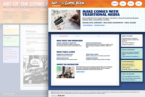
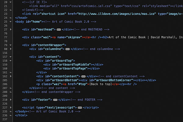
Art of the Comic Book started in 2010 as a course site I built on the fly while running the class. At the time it worked well as a single source for students to get syllabi, assignment descriptions, and other resources. Content and expectations grew as the information architecture got increasingly stale. The custom HTML and CSS structure proved difficult to maintain. The site's secondary purpose as a web design portfolio piece became a liability.
Version 1 development
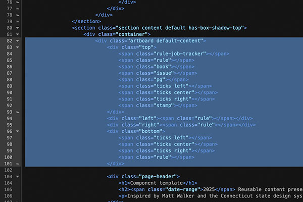
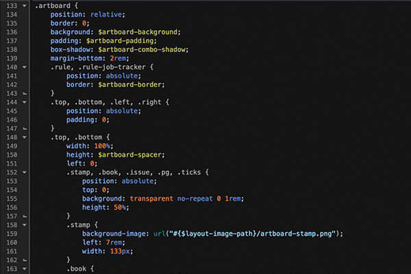
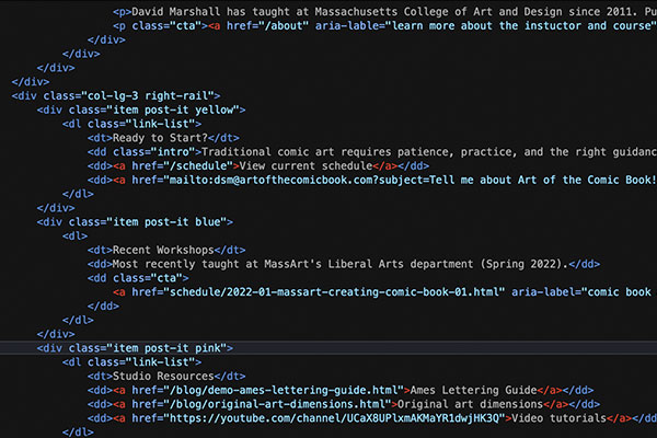
The artboard style (white rectangle with markings designed to resemble a comic book original art board) was an elaborate grid of absolute-positioned background image divs with pixel-defined sizes. Post-its were stacks of same-width rows, with only the middle vertically expanding with content.
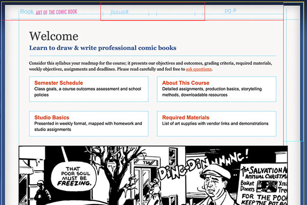
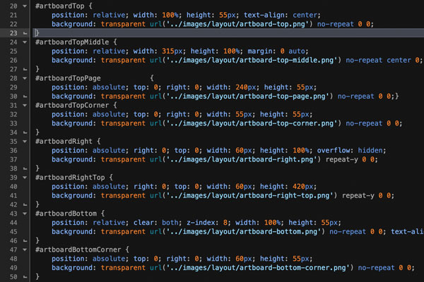
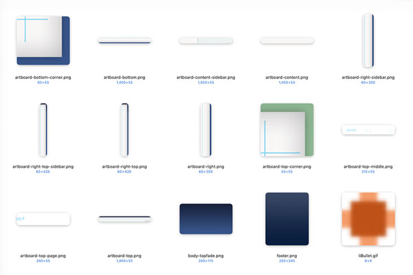
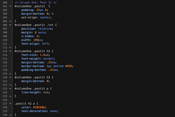
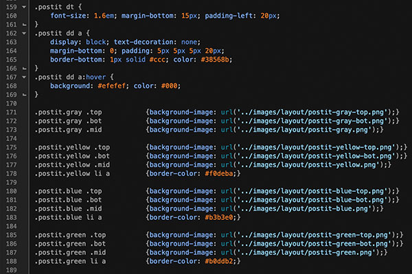
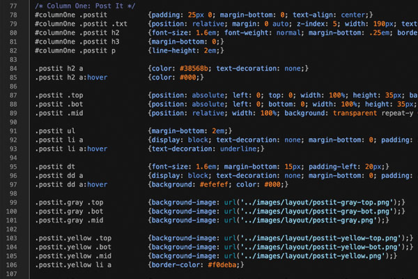
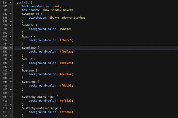
I updated the responsive performance with Bootstrap in the summer of 2021, making preservation of the original visual design a top priority. A lot of development time went into hammering the Art of the Comic Book visual brand into Bootstrap — today's CSS made some tasks considerably easier. The artboard style, previously an elaborate grid of absolute-positioned background image divs with pixel-defined sizes, is now entirely in CSS. Same for the post-it style. A UI component library followed in 2025: lead story, tile and feature cards, link lists, and more.
Version 2 development
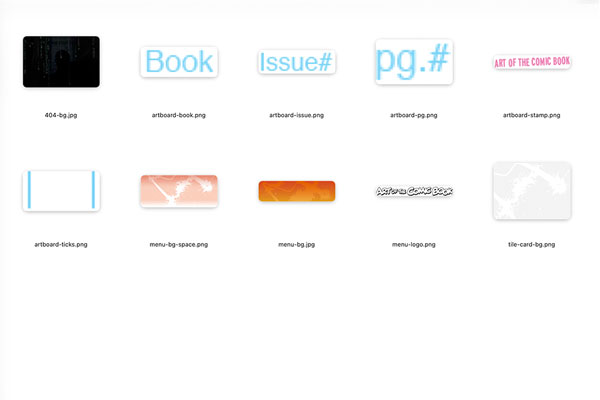
The new Artboard and Post-it styles are entirely in CSS3, with very few support images.
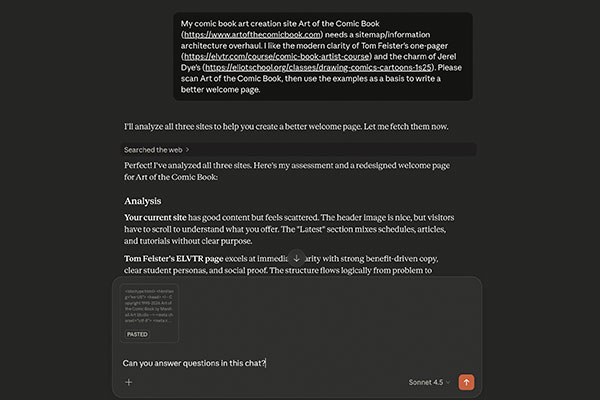
With the visual and accessibility work done, the next phase was content and information architecture. Newer comics workshop sites made Art of the Comic Book look disorganized and confusing by comparison. Being too close to the material to see it clearly, I needed objective user experience guidance. I used Claude across two extended working sessions as a content editor and information architecture sounding board.
What Claude showed me
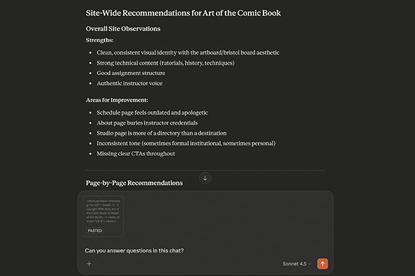
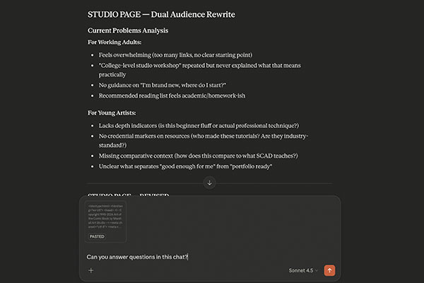
Content didn't have research-driven hierarchy. The site was littered with self-deprecating humor that unintentionally eroded visitor confidence. Most of the copy wasn't written for prospective students — it was written for people who were already enrolled. The About page had evolved into something between a faculty bio and a personal essay. The Schedule page included the line: "There's probably no value in posting the ancient data, but I'm too swamped to properly design the user experience." That sentence had been live long enough that I'd stopped seeing it. An outside reader sees it immediately.
Finding the real audience
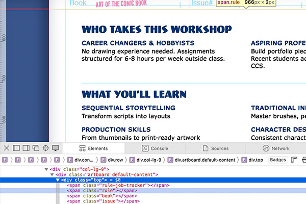
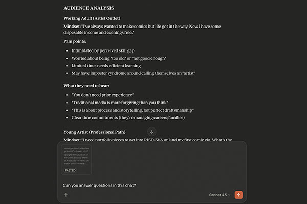
My first task was identifying who actually takes this course. The answer was two distinct groups:
- Career changers and hobbyists — working adults who've wanted to make comics since they were twelve and finally have the time and disposable income. They're intimidated by skill gaps and need to hear that no prior experience is required. Time commitment matters to them.
- Aspiring professionals — young artists building portfolio pieces for art school applications or a first industry submission. They're comparison-shopping against programs at Rhode Island School of Design, Savannah College of Art and Design, and School of Visual Arts. They want instructor credentials, real assignments, and outcomes they can point to.
This dual-audience framing became the editorial standard for every page on the site — hero copy, assignment descriptions, instructor bio, schedule status, all of it.
What the collaboration looked like
The workflow was surgical. Prompting Claude to act as my dual audience, I outlined my goals and told it to study the existing website. It came back with copy rewrites, page layout suggestions, and overall information architecture refinements — all driven by how it interpreted the needs of that audience.
Working with Claude
Prompts and responses
What surprised me was how quickly it internalized the messaging and design conventions. After a couple of pages it understood the right-rail post-it patterns, the distinction between assignment pages and reference pages, the sentence case header style. Two specific examples worth mentioning:
- The assignment pages. Nine pages converted from single-column syllabus format to a standardized two-column template: overview, dual-audience rationale, phased workflow with task lists, requirements and common challenges split into two columns, right-rail resources. A requirements summary line was added to each page intro — something like "3 pages • Assigned story prompts • 10-15 hours" — giving a prospective student an immediate at-a-glance sense of commitment before reading a word.
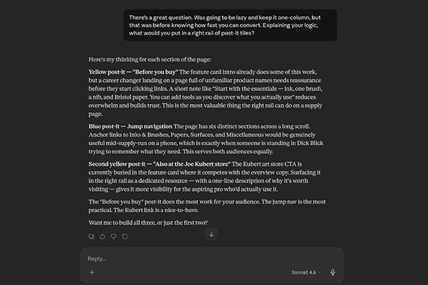
- The art supplies page. Was a single-column link list. Converted to two columns with a four-tile right rail: before you buy, jump navigation, required vs. optional, and local Boston-area shops. The right rail decisions came out of a conversation about what someone actually needs when they land on a supply page — and the answer split neatly between someone arriving for the first time and someone standing in a store mid-supply-run trying to remember what they need.
Where it broke down
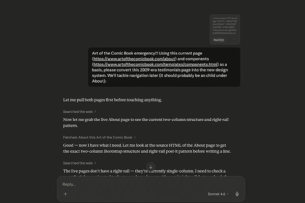
The collaboration wasn't frictionless. Stale cached content returned outdated page versions on at least two fetches — I had to supply screenshots to get accurate source material. I got the wrong component once, Post-it where I'd asked for Multi-link. There were moments where the suggested copy drifted toward generic before I pulled it back toward the site's actual voice.
None of those were significant problems. They were the normal friction of working with a tool that has real capabilities and real limits. The corrections were fast. But every output needed a human eye before it touched the codebase — that part never changed.
What it's actually good for
Using AI sped up the editorial process considerably. Done on my own, this would have taken months, and almost certainly wouldn't have been as systematically well-realized. Bouncing ideas and concerns with Claude was like having an on-demand content strategist — not a replacement for peer review from people who know the field, but a present one at whatever hour I was working.
The site is cleaner, better organized, and written for an audience that actually exists. Whether it converts prospective students more effectively is a question the next registration cycle will answer — but the UX problems it was solving were real, and for a hiring manager evaluating this work, the process is as relevant as the outcome.
Art of the Comic Book: artofthecomicbook.com
David Marshall